Theming & Tokens
Reepolee's design tokens live in a single @theme block in css/app.css. Colours, typography, spacing - anything you want to be themeable - gets defined as a CSS custom property in this block. Tailwind v4 automatically generates utility classes from every token you declare, so the same colour you use in @theme is reachable as bg-*, text-*, border-* in templates without any extra plumbing.
Because tokens are CSS variables, they cascade. A specific section of the app can override a token by re-declaring it on a parent element, and every utility that depends on that token picks up the override. You don't need to define separate "dark mode" or "high-contrast" variants in the build - you change the variables.
The @theme Block
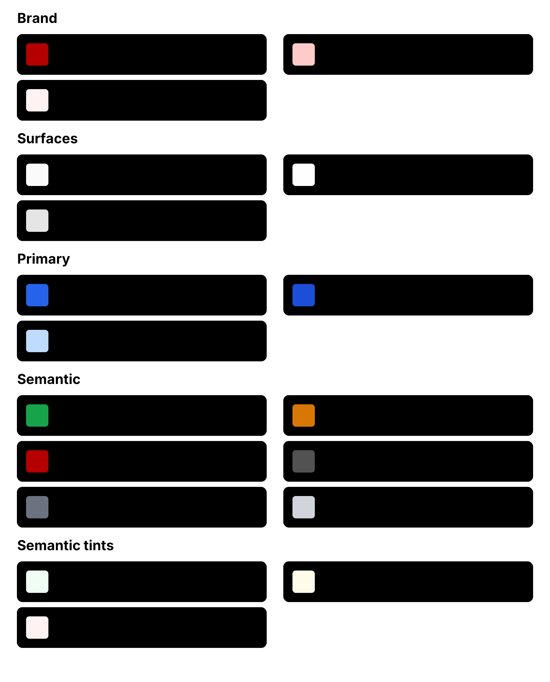
All design tokens go inside one @theme { ... } block near the top of css/app.css:
@theme {
    /* Brand */
    --color-brand: #b40000;
    --color-brand-50: #fef2f2;
    --color-brand-100: #fecaca;

    /* Surfaces */
    --color-surface: #fafafa;
    --color-surface-raised: #fefefe;
    --color-surface-sunken: #e5e5e5;
    --color-surface-overlay: #1f2937;

    /* Primary (Blue) */
    --color-primary: #2563eb;
    --color-primary-50: #eff6ff;
    --color-primary-200: #bfdbfe;

    /* Semantic */
    --color-success: #16a34a;
    --color-success-50: #f0fdf4;
    --color-warning: #d97706;
    --color-warning-50: #fffbeb;
    --color-danger: #dc2626;
    --color-danger-50: #fef2f2;
    --color-text-secondary: #525252;
    --color-text-tertiary: #6b7280;
    --color-border: #d1d5db;

    /* Typography */
    --font-sans: ui-sans-serif, system-ui, -apple-system, BlinkMacSystemFont, "Segoe UI", Roboto, sans-serif;

    /* Radii */
    --radius-sm: 0.375rem;
    --radius-md: 0.75rem;
    --radius-lg: 1rem;
}
The shipped theme is a small but complete design system, grouped by intent: a brand scale, surface colours (page / card / sidebar), a primary action colour with a hover shade, a semantic set (success / warning / danger / muted / border, each with a light -50 tint where it's useful), the typography stack, and a set of radius tokens so corners stay consistent across cards, buttons, inputs, and dialogs. Each is a single line - add another --color-* (or --radius-*, --font-*) and Tailwind picks it up on the next build.
The semantic tokens are referenced by name throughout the rest of the stylesheet - bg-success / bg-danger for the yes/no pills and border-[var(--color-border)] for the secondary/tertiary buttons - so swapping a token's value re-themes everything that uses it.
Each token maps directly to a Tailwind utility based on the prefix:
| Token prefix | Generated utilities |
|---|---|
--color-* | bg-*, text-*, border-*, ring-*, outline-*, accent-*, caret-*, fill-*, stroke-* |
--font-* | font-* |
--text-* | text-* (font sizes) |
--spacing-* | p-*, m-*, w-*, h-*, gap-* |
--radius-* | rounded-* |
--shadow-* | shadow-* |
So --color-brand: #b40000 gives you bg-brand, text-brand, border-brand, and the rest of the colour utilities for free. Adding a new shade is a single line in @theme.
Brand Swap in One Place
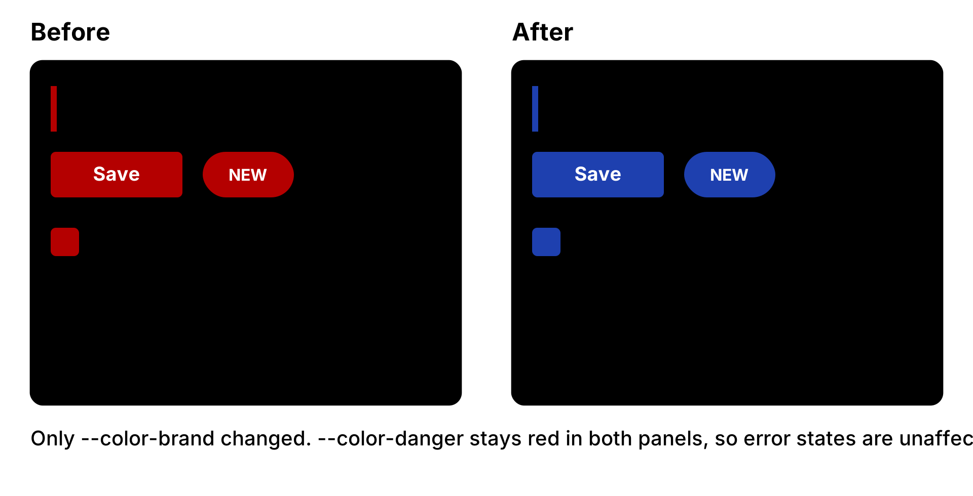
The point of centralising tokens is making palette changes trivial. To switch the brand colour across the entire application, change the value once in @theme:
@theme {
    --color-brand: #1e40af; /* was #b40000 */
}
Every utility that referenced --color-brand - buttons, badges, the active nav border, the logo SVG that uses currentColor - picks up the new value on the next page load. No other files need to change.
The shipped theme already separates these concerns: --color-danger is its own token (it happens to share the brand's red today). So if you swap --color-brand to a new colour, error states stay red because they reference --color-danger, not --color-brand - change them independently whenever you want them to diverge.
Base Styles
Global element defaults go in @layer base. This is where the document font size, heading hierarchy, and native element overrides live:
@layer base {
    html {
        color-scheme: light;
        scrollbar-gutter: stable;
        font-size: 0.875rem;
        font-family: var(--font-sans);
        accent-color: var(--color-brand);
    }

    h1 {
        @apply text-3xl font-semibold;
    }
    h2 {
        @apply text-xl font-light;
    }

    dialog::backdrop {
        background: color-mix(in oklab, var(--color-surface-overlay) 20%, transparent);
        backdrop-filter: blur(1px);
    }
    dialog {
        border: none;
        padding: 0;
        border-radius: var(--radius-md);
        position: fixed;
        top: 50%;
        left: 50%;
        transform: translate(-50%, -50%);
    }
}
scrollbar-gutter: stable prevents layout shift when the scrollbar appears as page content grows. font-size: 0.875rem (14px) on html rescales every rem-based utility from there, and font-family: var(--font-sans) applies the theme's font stack globally. accent-color: var(--color-brand) tints native controls (checkboxes, radios, range inputs) brand-red without per-element rules. The dialog radius pulls from --radius-md, so dialogs match the corner language defined in @theme.
Use @apply inside @layer base rules to compose Tailwind utilities - it works the same way it does in @layer components. The result is a stylesheet that's mostly Tailwind utilities, with a thin layer of element-level defaults written in the same vocabulary.
Custom Utilities
@utility in Tailwind v4 defines a class that behaves exactly like a built-in utility. Reepolee ships three semantic button utilities:
@utility primary {
    @apply bg-primary shadow-neutral-500 hover:shadow;
    color: contrast-color(var(--color-primary));
}

@utility secondary {
    @apply border border-[var(--color-border)];
}

@utility tertiary {
    @apply hover:border hover:border-[var(--color-border)];
}
The clever piece is color: contrast-color(var(--color-primary)). CSS's contrast-color() function picks black or white text automatically based on the contrast ratio against the given background. Swap the --color-primary token and the text colour adjusts itself - no manual text-white or text-black to remember. secondary and tertiary draw their outline from the shared --color-border token, so every button variant tracks the same border colour.
Usage in templates:
<button class="primary rounded px-3 py-2">Save</button>
<button class="secondary rounded px-3 py-2">Cancel</button>
<a class="tertiary rounded px-3 py-2">Details</a>
Custom utilities compose with the rest of Tailwind - primary adds the background and contrast colour, rounded px-3 py-2 handles the radius and padding. Neither piece needs to know about the other.
Component Classes
@layer components is for reusable named classes - patterns that show up across templates but aren't quite custom utilities. The defaults cover the patterns used by the generated admin interface:
@layer components {
    .nav-item {
        @apply border-l-8 border-l-transparent py-2 pl-2;
    }
    .nav-item.current {
        @apply border-l-brand;
    }

    a[role="button"],
    .button {
        @apply cursor-pointer rounded-sm px-3 py-2 hover:scale-105;
    }
}
.nav-item is paired with the is_current() template helper - see Helpers & Globals. The helper returns "font-bold nav-item current" for the active page and "nav-item" for the rest, so the same <a class="{= is_current('/users') }"> line handles both states.
a[role="button"] styles any link with a button role automatically, using the small-radius button style - so templates stay clean while keeping native semantics intact (a link is still a link, just styled like a button). Checkboxes no longer need a component rule: the accent-color: var(--color-brand) on html (above) tints them at the document level.
The shipped stylesheet also defines a handful of pill utilities (pill-layout, pill-default, pill-yes, pill-no) that the pill() and tags() template helpers render into. They live as @utility blocks alongside primary / secondary / tertiary further down the file.
Modular Imports
The base styles file pulls in two more stylesheets:
@import "./forms.css";
@import "./toasts.css";
@import "./filters.css";
@import "./markdown-editor.css";
/* @import "./transitions.css"; */
forms.css styles native form controls - covered in Form Defaults. toasts.css carries the animation keyframes for the <toasts-area> notifications. filters.css styles the right slide-in filter panel used by the generated list views - a dialog.filter-panel that slides in from the right edge (paired with static/filter-panel.js) for the per-column filters and filter chips on admin grids. transitions.css is commented out by default - uncommenting it enables the View Transitions API, covered in Page Transitions.
Add more imports the same way for project-specific styling that doesn't fit in the main app.css - print stylesheets, admin-only utility classes, anything else.
Dark Mode and Variant Themes
The cleanest way to support a dark mode is to declare the dark variants of every token in a :root.dark or [data-theme="dark"] selector outside the @theme block:
:root[data-theme="dark"] {
    --color-surface: #111827;
    --color-surface-raised: #1e293b;
    --color-border: #334155;
    --color-text: #f1f5f9;
    --color-text-muted: #cbd5e1;
}
Toggle the attribute on <html> with a small signal-driven script (document.documentElement.dataset.theme = "dark" inside an effect()) or a one-line cookie + server-side render, and every Tailwind utility that references those tokens flips colour without any markup changes.
The same approach works for per-section themes - an admin area with its own palette, a marketing page with a brand-different look. Declare the variant on a parent element, and all descendants pick up the overrides. No build step, no separate stylesheet.