Input Components
Every standard HTML form field has a matching .ree component in components/ that shows the canonical markup for that field type - a <field-wrapper> around a <label>, the <input>, and a <validation-error id="error-{name}"> that FormController writes per-field errors into.
In practice, generated CRUD forms inline this markup directly into form.ree with the field name baked in, reading the field's label and value straight off the page's props - because the field name is known at generation time. A text field looks like this in a form:
<field-wrapper class="grid">
    <label class="px-3" for="email">{_ labels.email }</label>
    <input type="email" id="email" name="email" value="{= props.email }" />
    <validation-error class="mt-1" id="error-email"></validation-error>
</field-wrapper>
The component files (components/input-email.ree, etc.) are the reference implementations of each field type - read them to see exactly what HTML you get. Build forms from the inlined markup above, or invoke a component as a ReeTag with interpolated attributes - see Components.
The Shared Data Shape
Each field needs three pieces of data, present in the inlined markup:
| Piece | Purpose |
|---|---|
name | Field name (matches the column in the database) - the id/name/for attributes |
label | Visible label, usually a translation read with {_ labels.<field> } |
value | Current value (props.<field> or props.record.<field>); blank for new records |
Because the value comes from props, the same markup works for create (where the value is undefined or empty) and edit (where the existing record's field is rendered) without any branching.
The associated <validation-error> element gets the id error-{name} so FormController can find it and write the per-field error into it. The full validation flow is on the Validation page.
Text Inputs
The text-input family covers most everyday fields. They differ only in the type attribute they render, but each one is its own component so you don't have to remember which type value to pass:
| Component | HTML type | Use for |
|---|---|---|
input-text | text | Names, codes, generic strings |
input-email | email | Email addresses (gets free client validation + mobile keyboard hint) |
input-password | password | Passwords (masked) |
input-tel | tel | Phone numbers |
input-url | url | URLs |
input-search | search | Search boxes |
A typical text input renders along these lines:
<field-wrapper class="grid">
    <label class="px-3" for="title">{_ labels.title }</label>
    <input type="text" id="title" name="title" value="{= props.title }" />
    <validation-error class="mt-1" id="error-title"></validation-error>
</field-wrapper>
<field-wrapper> is a ReeTag that exists purely for styling - browsers treat any unknown element with a hyphenated name as HTMLElement, and <field-wrapper> wraps the label, input, and error together for grid layout. FormController discovers the input by its name attribute and writes any per-field error into the matching <validation-error id="error-{name}"> element.
Number, Date, and Time Inputs
| Component | HTML type | Notes |
|---|---|---|
input-number | number | Numeric input with browser-side step validation |
input-date | date | Renders an ISO date string (YYYY-MM-DD) |
input-date-masked | masked date | Locale-aware segmented date field (see below) |
input-time | time | Renders a 24-hour time string (HH:MM) |
input-datetime-local | datetime-local | Combined date and time picker |
For date and datetime fields backed by SQL DATETIME columns, apply a codec in the form schema so the database format and the input format both work - see Date Codecs.
The Masked <date-input> Field
input-date-masked renders the masked <date-input> custom element instead of the native picker: it splits the date into day / month / year segments laid out in the active locale's order, masks typing as you go, and validates the calendar date client-side before committing a YYYY-MM-DD value to the hidden input. The generated date.ree field template uses <date-input> directly, passing locale="{= props.locale }" and spreading ...props.translations.errors so the component's messages come from the errors.* translations of the active locale. Server-side, the same z_date_* codecs from Validation → Date Codecs remain the source of truth. For the segment masking, locale layout, and keyboard behaviour in detail, see Web Components → date-input.
Textarea
input-textarea renders a <textarea> element. It uses CSS field-sizing: content so the textarea grows with its content instead of showing a scrollbar:
<field-wrapper class="grid">
    <label class="px-3" for="bio">{_ labels.bio }</label>
    <textarea id="bio" name="bio">{= props.bio }</textarea>
    <validation-error class="mt-1" id="error-bio"></validation-error>
</field-wrapper>
For rich-text editing, swap in a JavaScript editor (Pell, Quill, ProseMirror) in your own custom component, or use the shipped markdown editor below. Reepolee also ships a Pell-based HTML editor for the Email Module admin form.
Markdown Editor
Set a column's comment to markdown (the same plain-word hint mechanism as textarea and autocomplete - see Generators) and the generator renders a <markdown-editor> field instead of a plain textarea:
<field-wrapper class="grid lg:col-span-2" data-field="body">
    <label class="px-3" for="body">{_ labels.body }</label>
    <markdown-editor id="body" name="body" value="{= record.body }"></markdown-editor>
    <validation-error class="mt-1" id="error-body"></validation-error>
</field-wrapper>
<markdown-editor> (static/web-components/markdown-editor.js, loaded globally in apps/main/layout.ree) is a form-participating WYSIWYG editor: it wraps a real <textarea name="..."> in the light DOM so FormController's field discovery and validation-error wiring work unchanged, and shows a contenteditable surface with a formatting toolbar (bold, italic, code, link, headings, lists, blockquote) on top. Edits sync back into the hidden textarea as markdown on every keystroke.
The supported markdown subset matches what the server renders with Bun.markdown.html(): headings (h1-h3), bold, italic, inline code, links, ordered/unordered lists, and blockquotes. Round-tripping through anything outside that subset isn't guaranteed.
In the generated list view, a markdown field renders through the md() template helper (raw markdown → HTML) inside a line-clamp-5 cell, so a long body shows a preview instead of the raw markdown source or an overflowing block.
For the component's internals - the toolbar commands, raw markdown mode, copy/paste handling, and how it keeps the textarea in sync - see Web Components → markdown-editor.
Select, Checkbox, and Radio
input-select renders a <select> with options pulled from props.options[name]. The parent template provides the options and loops them into the markup:
<field-wrapper class="grid">
    <label class="px-3" for="role">{_ labels.role }</label>
    <select id="role" name="role">
        {#each props.options.role as opt }
            <option value="{= opt }" {#if opt === props.role }selected{/if}>{= opt }</option>
        {/each}
    </select>
    <validation-error class="mt-1" id="error-role"></validation-error>
</field-wrapper>
The input-select.ree component takes its list from an options attribute, falling back to props.options[name] - so the same component works whether you hand it a list directly (options="{~ props.roles }") or pre-attach them to a shared props.options object higher up.
input-checkbox renders an <input type="checkbox">. It checks the box when the value is truthy. Submit semantics follow native HTML: a checked box sends name=on; an unchecked box sends nothing. Reepolee's generated handlers translate this into a boolean by checking whether the field was present in the request body.
input-radio renders the whole group - a <fieldset> with a <legend> and one radio per entry in its options list, all sharing the field's name. Unlike input-select, whose options are plain strings, its options are objects with value and label:
<input-radio name="tier" label="{_ labels.tier }" value="{= props.record.tier }" options="{~ props.tiers }"></input-radio>
The entry whose value matches the component's value renders checked. Native form submission picks the right one.
Foreign-Key Selects
The generator detects foreign-key relationships (either by explicit FOREIGN KEY constraint or by columns ending in _id) and renders them with input-select automatically. The dropdown is populated from the related table's first non-integer text column, or from a column named title or name if one exists. You can override the label source in the route's table.ts after generation.
Banner
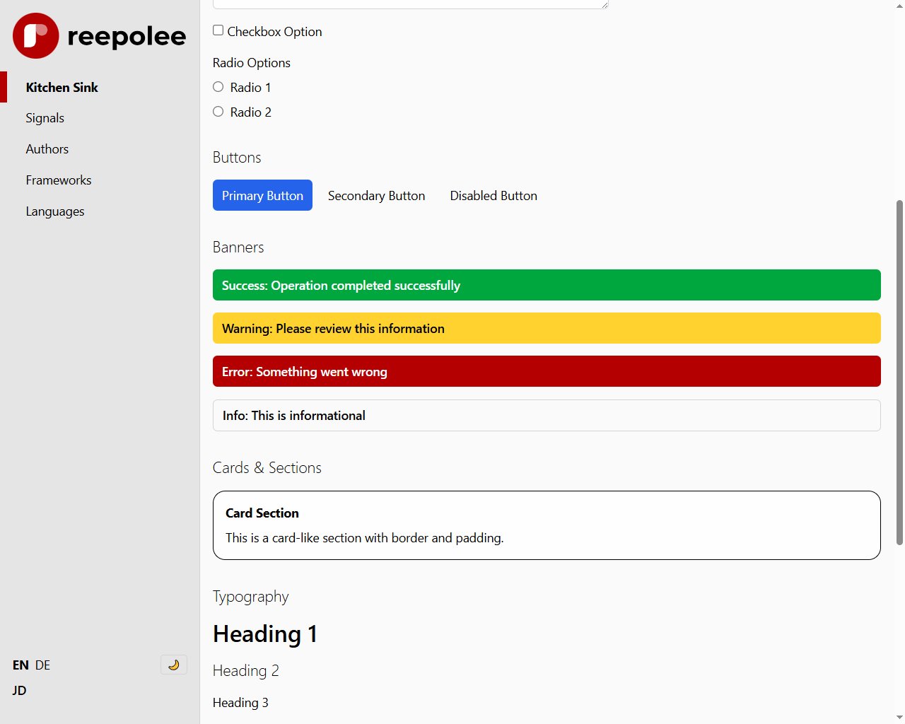
app-banner is for form-level messages - successes, errors, or warnings that apply to the whole form rather than a single field. It takes a type attribute and the message as slot content:
{#if props.form_errors }
    <app-banner type="red">{= props.form_errors }</app-banner>
{/if}
The type values: "green" (success), "yellow" (warnings), "red" (errors), "blue" (informational), or anything else (neutral, with a light border). Omitting type entirely gives you "green". The component reads props.attributes.type, computes the final class string in a {{ ... }} block, and renders a styled <div> around props.children. Any other attributes you pass are forwarded onto that <div> via the spread shorthand - <app-banner type="red" id="save-error"> puts the id on the rendered element.
Complete List
For reference, the full set shipped with Reepolee:
components/
|-- app-banner.ree            form-level message banner
|-- app-switcher.ree          in-app navigation switcher between main/reeman/reeqa
|-- auto-complete.ree         type-ahead text input
|-- busy-poller.ree           polling state indicator for long-running operations
|-- confirm-dialog.ree        confirmation dialog
|-- domain-select.ree         domain-type-aware column selector
|-- file-upload.ree           document upload with drag-and-drop
|-- image-upload.ree          image field with preview
|-- input-checkbox.ree
|-- input-color.ree           native colour picker
|-- input-date.ree
|-- input-date-masked.ree     masked date field with locale-aware segments
|-- input-datetime-local.ree
|-- input-email.ree
|-- input-foreign-key.ree     select populated from a related table
|-- input-markdown.ree        markdown-editor field, wrapped for forms
|-- input-number.ree
|-- input-password.ree
|-- input-radio.ree
|-- input-search.ree
|-- input-select.ree
|-- input-tags.ree            comma-separated tags as chips
|-- input-tags-select.ree     tag chips picked from a fixed option list
|-- input-tel.ree
|-- input-text.ree
|-- input-textarea.ree
|-- input-time.ree
|-- input-url.ree
|-- input-yes-no.ree          tri-state yes/no/unset select
|-- localized-field-tabs.ree  locale tab switcher for localized-content fields
|-- localized-panel.ree       single-locale input panel inside a field panel
|-- my-h1.ree                 styled heading
|-- ree-breadcrumbs.ree       breadcrumb navigation
|-- ree-filters.ree           list-view filter bar
|-- ree-icon.ree              inline icon
`-- star-rating.ree           1-5 star rating widget
(localized-copy-bar.ree also exists but is an intentionally-empty compatibility shim for CRUD forms generated by an earlier version - not something to build new forms against.)
The plain input fields are small (~10 line) .ree files; the interactive ones (input-tags, auto-complete, image-upload, file-upload) pair their markup with a script. Read them when you want to know exactly what HTML you're getting - they are short, self-contained, and easier to read than this documentation describes. input-color, input-tags, and star-rating are walked through line by line in Custom Form Components. The client behavior of image-upload and file-upload - async upload, drag-and-drop, hidden-input sync - is covered in Upload Components.
Extending and Customizing
To change how an input renders project-wide, edit the component file directly. It is part of your codebase, not a runtime dependency - the changes you make persist forever and apply to every form that uses the component.
To add a new field type - a colour picker, a slider, a tag input - drop a new file into components/ and reference it by name. The Custom Form Components recipe walks through this end-to-end, including how to ensure live validation continues to work and how to add signal-driven interactivity for inputs that need it.
If you find yourself needing a one-off variant for a specific page - a wider text input on the email composer, say - add the variation as a CSS class right in the inlined markup:
<field-wrapper class="grid">
    <label class="px-3" for="subject">Subject</label>
    <input type="text" id="subject" name="subject" value="{= props.record.subject }" class="w-full text-lg" />
    <validation-error class="mt-1" id="error-subject"></validation-error>
</field-wrapper>
If you instead invoke a reusable component as a ReeTag, the shipped inputs read only name, label, and value - an extra attribute is ignored until the component reads it. To support one, destructure it alongside the others and render it:
{{ const { name, label, value, input_class } = props.attributes ?? {}; }}
<input type="text" id="{= name }" name="{= name }" value="{= value }" class="{= input_class }" />
<input-text name="subject" label="Subject" input_class="w-full text-lg"></input-text>