Dialogs
Reepolee leans on the native <dialog> element for every modal in the framework. The browser handles modal behaviour, focus trap, escape-key dismissal, and the ::backdrop pseudo-element. Opening, closing, and confirming happen through HTML attributes - commandfor and command - using the native Invoker Commands API. The one piece of JS Reepolee ships is a small script that makes the show-modal command reliably call showModal() (the experimental Invoker Commands API can otherwise open a dialog non-modally).
The shipped file is static/dialog-confirm.js. Include it on any page with a dialog; skip it otherwise.
Loading It
Include the script once on any page that uses a confirm dialog:
<script src="/dialog-confirm.js?v={= props.version}"></script>
That's the only setup. Open/close need nothing - they're native HTML.
Creating a Dialog
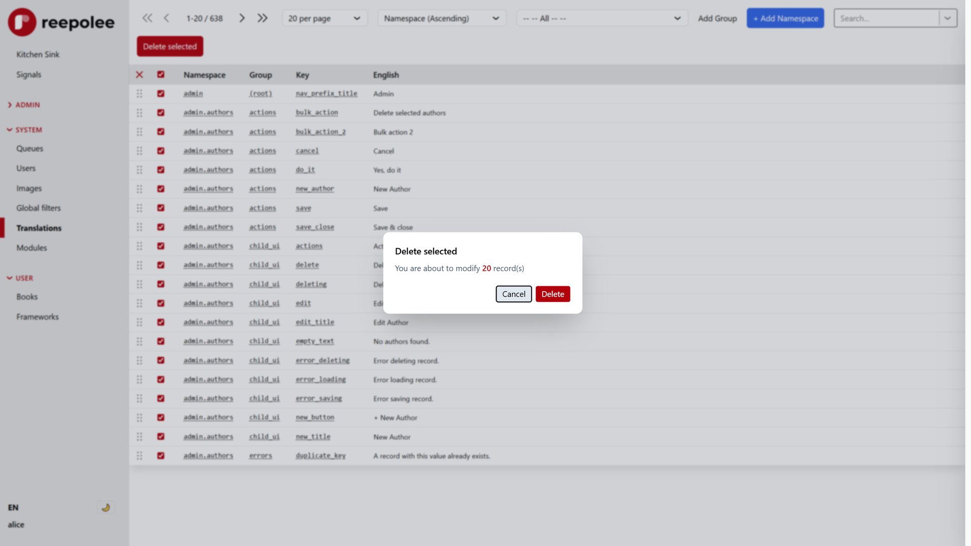
A dialog is a <dialog> element. Open it with a button that has commandfor pointing at the dialog's id and command="show-modal". Close it with a button inside the dialog that has commandfor pointing back at the same id and command="close":
<button commandfor="confirm_delete_dialog" command="show-modal">Delete…</button>

<dialog id="confirm_delete_dialog" class="p-0 rounded-xl shadow-2xl w-100">
    <div class="p-6">
        <h2 class="text-lg font-semibold">Delete this record?</h2>
        <p class="text-slate-600 mt-2">This cannot be undone.</p>

        <div class="mt-6 flex justify-end gap-2">
            <button class="px-3 py-1 rounded bg-slate-200" commandfor="confirm_delete_dialog" command="close">
                Cancel
            </button>
            <button class="px-3 py-1 rounded bg-reepolee text-white" command="--confirm" commandfor="confirm_delete_dialog">Delete</button>
        </div>
    </div>
</dialog>
Three things to notice:
- Trigger button uses
commandfor+command="show-modal"- the browser opens the dialog when the button is clicked. Noonclick, no signals. - Cancel button uses
commandfor+command="close"- same mechanism, closing this time. - Confirm button uses
commandfor+command="--confirm"- a custom command name (the--prefix is the Invoker Commands convention for author-defined commands). The dialog itself listens for it.
Confirmation Flow
Opening, closing, and confirming are all native command/commandfor invocations - no delegated click listener is involved in any of them. dialog-confirm.js exists only to patch show-modal:
document.addEventListener("click", (e) => {
    const btn = e.target.closest("[command='show-modal'][commandfor]");
    if (!btn) return;
    const dialog = document.getElementById(btn.getAttribute("commandfor"));
    if (!dialog || !(dialog instanceof HTMLDialogElement)) return;

    e.preventDefault();
    if (dialog.open) dialog.close();
    dialog.showModal();
});
Clicking a button with command="show-modal" normally lets the browser's native invoker handling open the dialog - but the experimental implementation can open it non-modally. This listener intercepts that click, prevents the native handling, and calls showModal() directly so the dialog is always properly modal.
For command="--confirm", no shared script is needed at all - the browser dispatches a native "command" event on the dialog (the commandfor target) when a custom-command button inside it is clicked. Your page listens for that directly:
<script>
    $("#confirm_delete_dialog").addEventListener("command", (e) => {
        if (e.command !== "--confirm") return;
        document.getElementById("confirm_delete_dialog").close();
        document.getElementById("delete-form").submit();
    });
</script>
That's the entire convention. Open uses dialog-confirm.js to guarantee a real modal; close is native HTML; confirm is one "command" listener checking e.command.
form method="dialog" - Native Submit-To-Close
For dialogs that just need to close on a button press without running custom logic, the native <form method="dialog"> pattern works without any JS - the browser closes the dialog on submit and reports which button was used through dialog.returnValue:
<dialog id="info_dialog">
    <p>Just an FYI.</p>
    <form method="dialog">
        <button value="ok">OK</button>
    </form>
</dialog>
The locale-mismatch dialog in apps/main/layout.ree uses this pattern for its dismiss button (the "switch to other locale" choice is just an <a href="?locale=…"> next to the form).
Canonical Examples
Two generator templates show the convention end-to-end:
- Bulk-action confirm -
generator/templates/index.ree. A "Bulk action" button opensaction_dialog; acommand="--confirm"button inside triggers a"command"listener that reads the selected checkbox values and runs the action. - Delete confirm -
generator/templates/form.ree. An "action_delete" button opensaction_delete_dialog; confirming submits the form with_action=delete.
Both follow the same shape: trigger button with commandfor + command="show-modal", cancel button with commandfor + command="close", confirm button with commandfor + command="--confirm", and a dialog.addEventListener("command", …) block that checks e.command === "--confirm".
Styling the Backdrop
The ::backdrop pseudo-element styles the dimmed area behind the dialog. The reference layout uses a subtle blur for the language-mismatch dialog:
#lang_mismatch_dialog::backdrop {
    background: rgba(0, 0, 0, 0.3);
    backdrop-filter: blur(4px);
    -webkit-backdrop-filter: blur(4px);
}
For project-wide defaults, target every dialog backdrop in your base styles:
dialog::backdrop {
    background: rgba(15, 23, 42, 0.2);
    backdrop-filter: blur(1px);
}
Positioning
Native <dialog> centres itself on the viewport by default. To override - for a settings panel that slides in from the right, say - set position, top, and left (or right) on the dialog element directly:
#settings_dialog {
    position: fixed;
    top: 0;
    right: 0;
    bottom: 0;
    margin: 0;
    width: 320px;
    border-radius: 0;
}
The browser keeps the modal behaviour (focus trap, backdrop) regardless of where you position it.
Animations
Native dialogs don't animate by default - they snap open and snap closed. To add an enter animation, use a CSS keyframe triggered by the dialog's open state:
dialog[open] {
    animation: dialog-in 0.2s ease-out;
}

@keyframes dialog-in {
    from {
        opacity: 0;
        transform: scale(0.95);
    }
    to {
        opacity: 1;
        transform: scale(1);
    }
}
For exit animations the story is more involved (the browser removes the element from the layout immediately on close), and most production apps either skip the exit animation or use :starting-style and transition-behavior: allow-discrete for the small set of browsers that support it. The trade-off is usually not worth the complexity for an internal admin UI.
Opening From JavaScript
If you need to open a dialog from code rather than a button click, use the native showModal() method directly:
document.getElementById("lang_mismatch_dialog")?.showModal();
This is how the layout opens the language-mismatch dialog when the page-language and preferred-language differ - a one-liner at the bottom of the rendered dialog.
Browser Support
Native <dialog> is supported in every evergreen browser. The commandfor + command invoker attributes are newer - they're available in current Chrome and Edge and ship as Baseline in 2025-era browsers. For older Safari and Firefox, the same buttons can fall back to onclick="document.getElementById('confirm_delete_dialog').showModal()", but for the audience Reepolee targets, the native attributes are the simplest path.